Forget the boring maps you had to review in school — these cool maps reveal interesting facts and figures about the world and country you live in.
You'll be surprised to learn the most popular last names in Europe, as well as the most beloved booze in each nation. Do you know where the billionaires of the world live? How about which countries are the happiest, and which are the most corrupt? Have you ever wondered what the world looked like centuries ago?
Check out the following maps for a fun read that will boost your confidence at the next trivia night you attend.
Note: Some of these maps contain slightly outdated numbers. Do not use these for your next test without doing your research first!
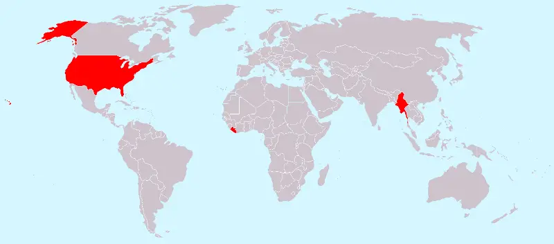
How many countries do not use the metric system other than the United States? Two!
Burma and Liberia are the only other countries on earth that do not use this system of measurement. (Myanmar, shown on this map, didn't used to officially utilize the metric system, but has started to adopt it.)
Perhaps it's time for the U.S., Burma and Liberia to join the rest of the world?
Britain has a long history of being one of the strongest nations on the planet — as can be seen through this map showing that nearly 90 percent of the world has been invaded by Britain at some point.
In fact, the "Telegraph" discovered only 22 countries that haven't been touched by Britain.
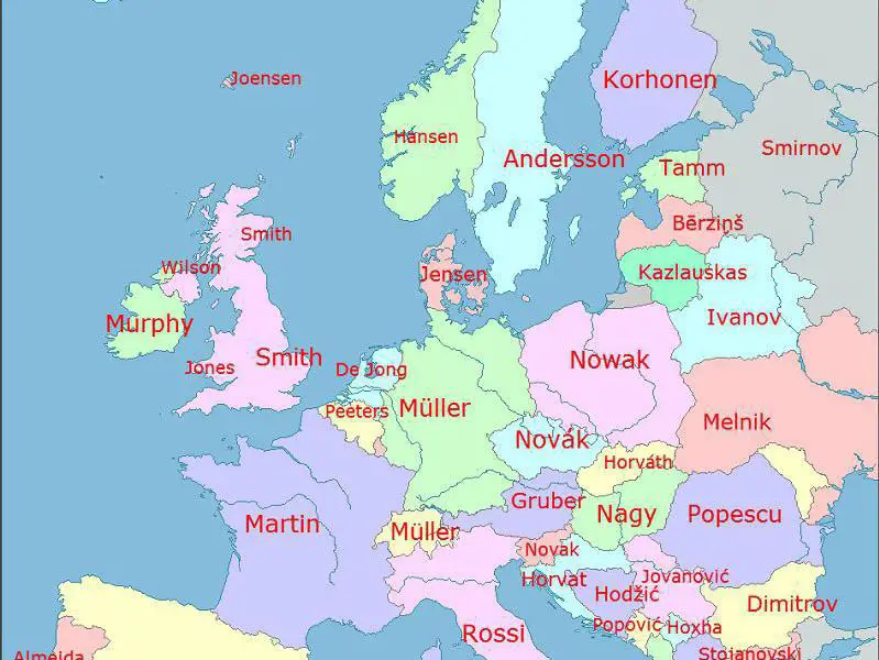
How did the most common last names in Europe come about?
Many surnames stem from a profession. In England, the popular surname Smith is derived from the Old English term meaning "one who works in metal." In Austria, Gruber translates to "miner."
Other names come from a parent's name, such as Ivanov, which translates into "Ivan's" (as in, the child of Ivan), or Dimitrov, which means "son of Dimitar."
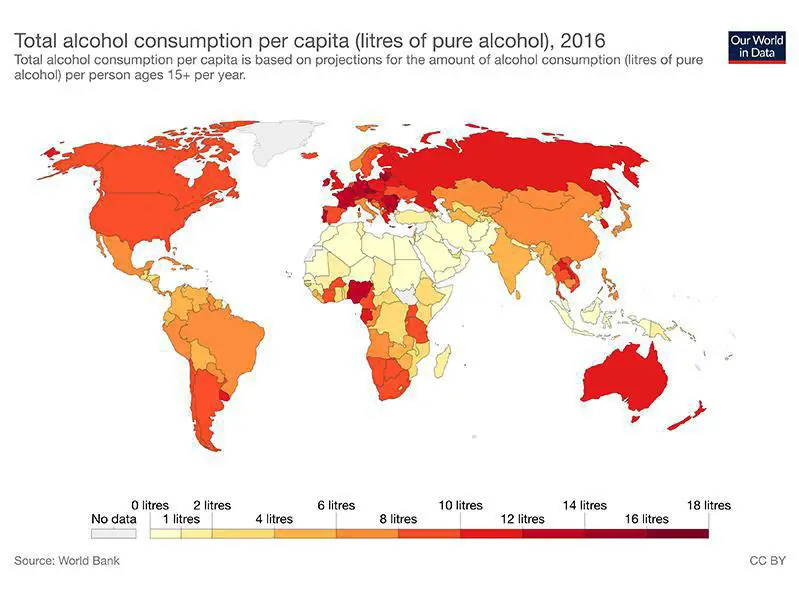
You're probably not shocked to learn that Ireland, Russia, France and Germany are some of the countries that consume the most alcohol. But you may be surprised to learn that tiny Belarus consumes the most alcohol of all, with an average of 17.5 liters of pure alcohol consumed per capita every year.
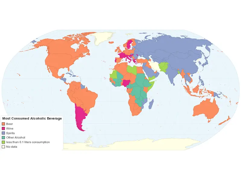
Looks like North and South Americans, as well as Australians, love their beer, while Asia, the Caribbean and Russia dig their spirits. Rice wine, rum and vodka, perhaps?
Ahem. Ireland?
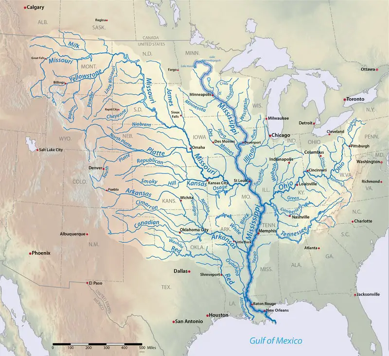
You may have heard that the Mississippi River is mighty, but if you ever doubted it, just take a look at this map. You'll see that an extraordinary number of the United States' rivers and tributaries send water into the Mighty Miss.
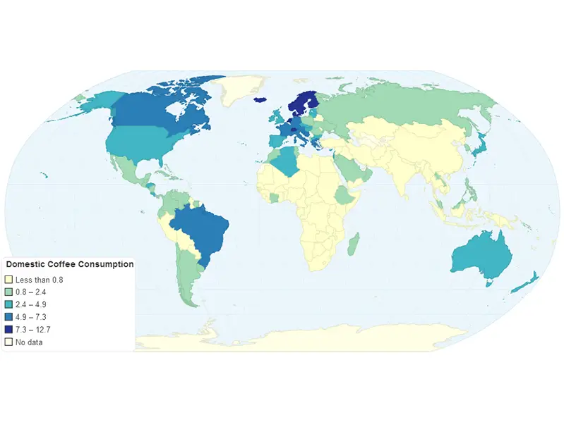
Can't live without your cuppa Joe in the morning? Looks like you're not the only one! In some countries, such as those in (colder) Scandinavia, each person is drinking up to 26 pounds of coffee per year.
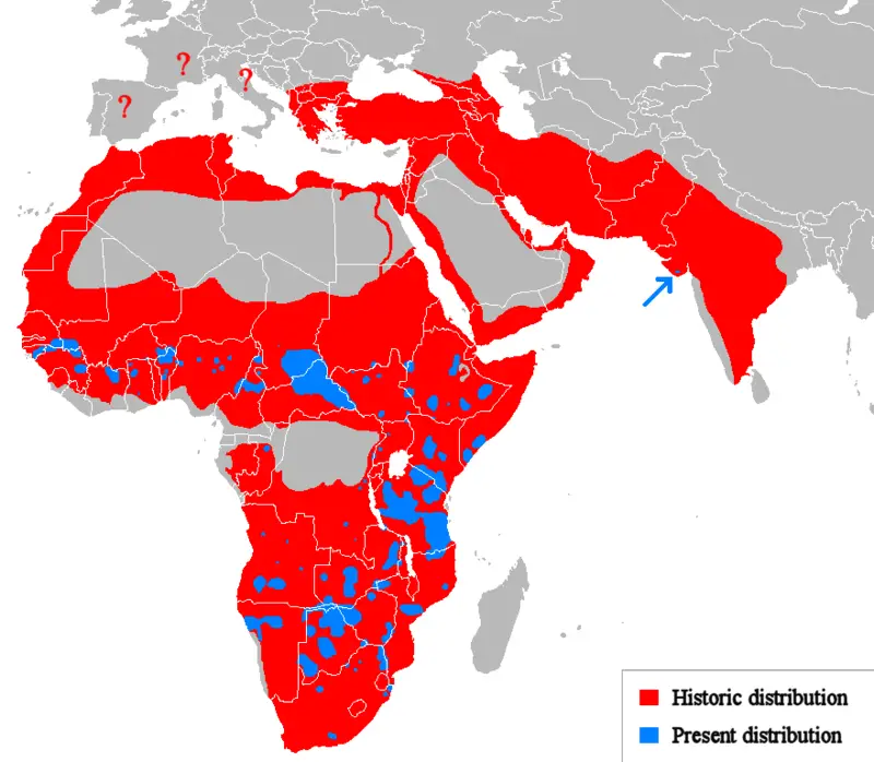
Once upon a time, lions really did rule over Africa. This map shows where the once mighty felines existed in Africa and Asia, and how few areas they remain in today.
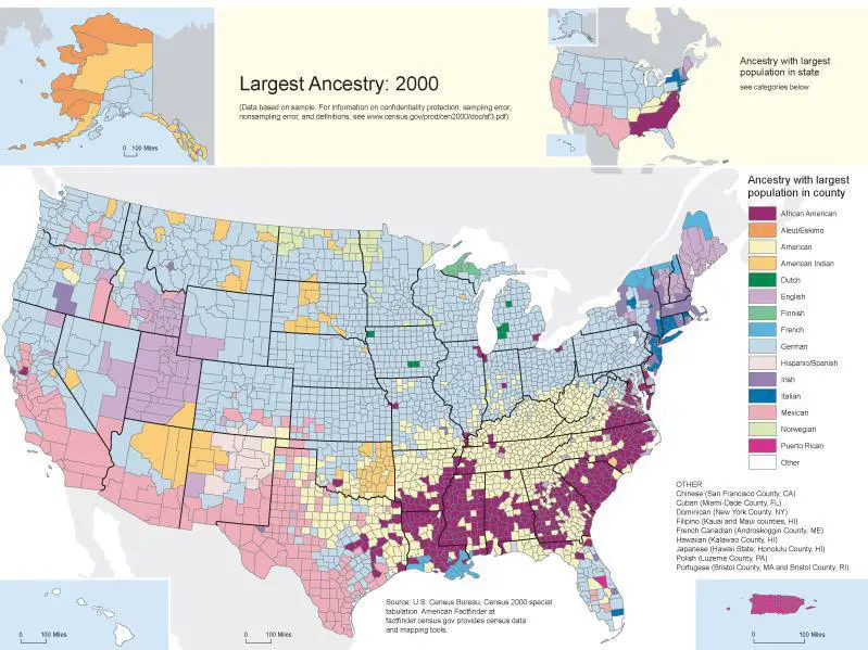
Who knew German ancestry was so prominent in the United States?
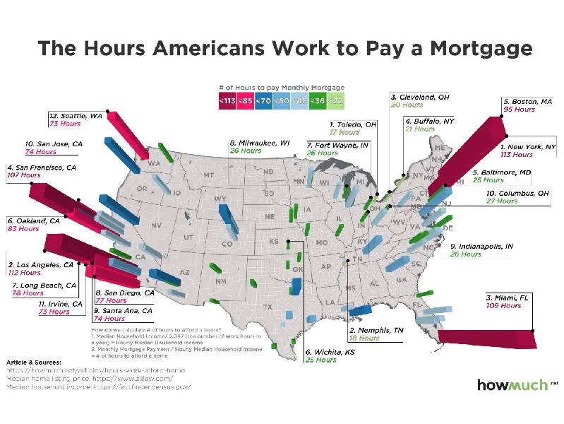
Just how long do you have to work each month to afford your mortgage payment? Are you within your state's median range?
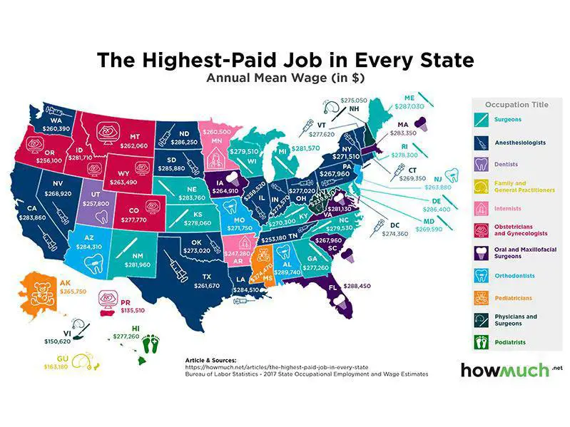
Where are the journalists? We may be considering a career change after checking out these salary differences!
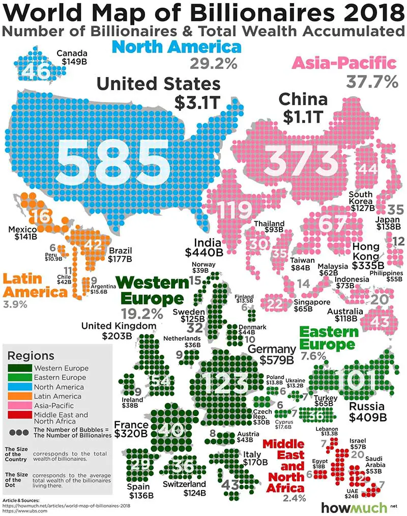
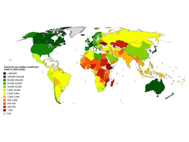
There are a lot more billionaires out there than you may have realized — 585 in the U.S. alone.
The richest region? Asia-Pacific, home to nearly 38 percent of those in the billionaires club.
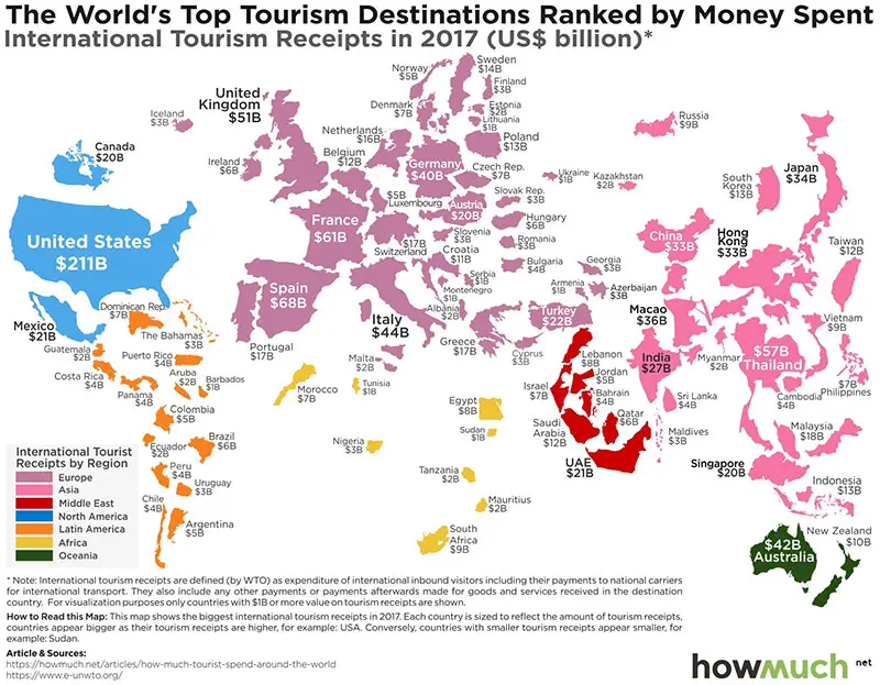
If you want to know where to travel that is off-the-beaten path, use this map to check out tourism expenditures. Forget Spain ($68 billion) or France ($61 billion) and head to Montenegro ($1 billion) or Cyprus ($3 billion) instead.
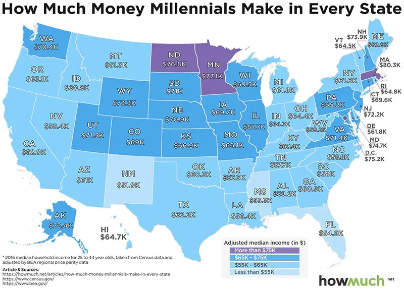
If you're a millennial and you aren't making what your peers are earning, it may be time to ask for a raise. Or, consider relocating to Minnesota, North Dakota or Massachusetts!
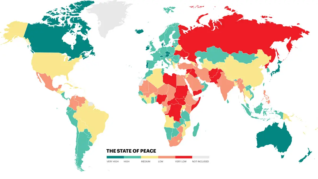
You may want to stay away from the most conflict-ridden countries in the world, and take a look at safe alternatives instead.
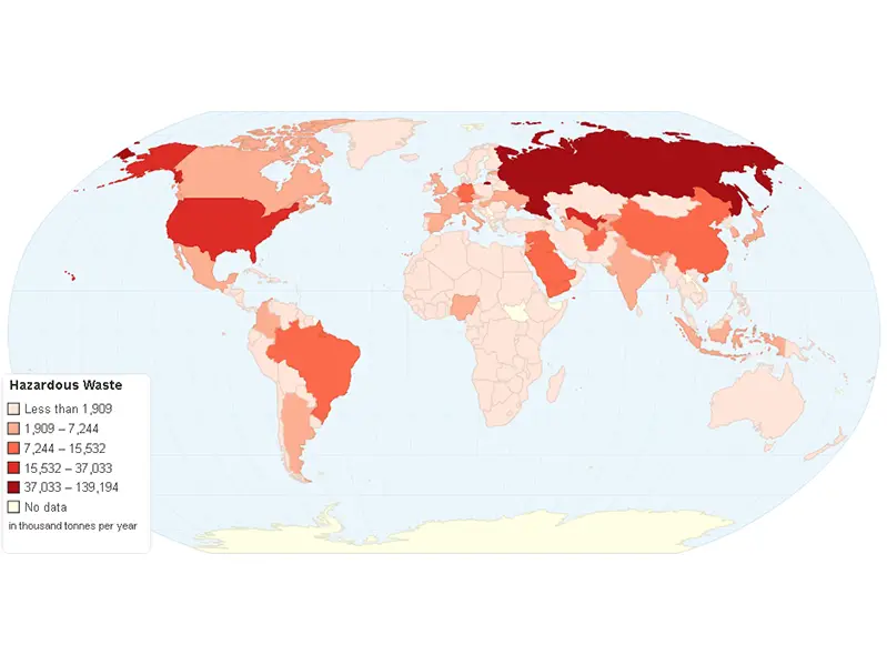
Tsk, tsk, Russia. Looks like you have the monopoly on hazardous materials.
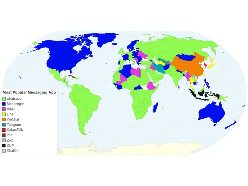
Which is your favorite free messaging app? (If you are using these when you're on the road, you may be spending too much on phone service!)
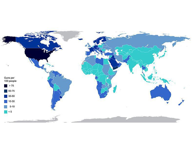
Who's packing the most heat? Surprise! It's the U.S. (Ok, we aren't actually surprised.)
In fact, get this: Americans own nearly half of all civilian-owned guns worldwide.
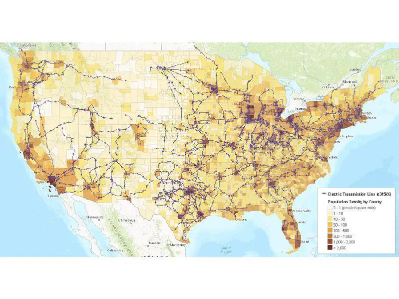
Who is sucking up the most energy? Big cities, obviously.
Which countries are doing well for themselves? Winners include Japan (where automobile-manufacturing and electronic-goods industries rake in the money), Iceland (where tourism and fishing reign supreme) and Australia (home to a booming minerals industry).
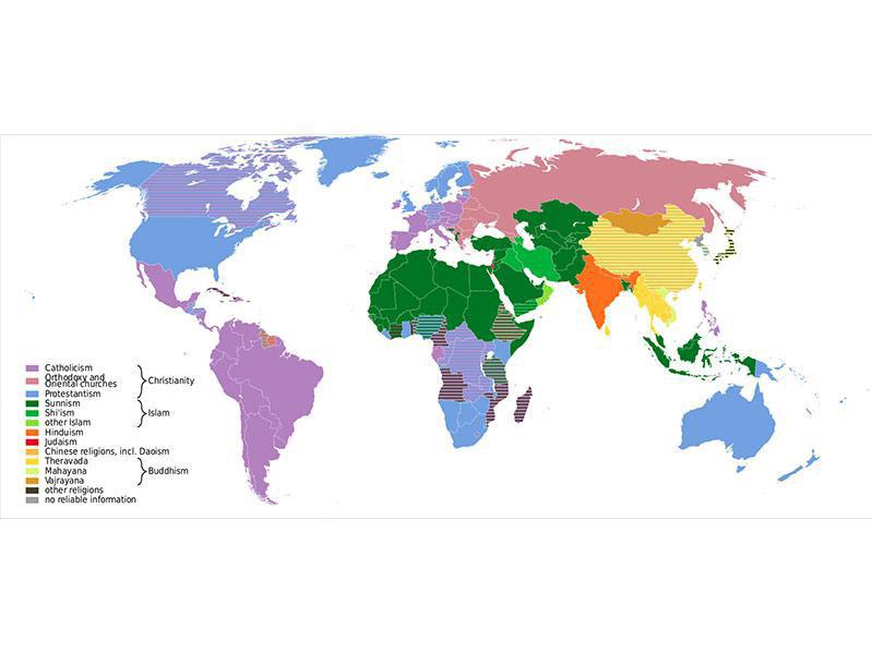
Christianity has the strongest hold across the world. Just how strong? More than 2.2 billion people worldwide are Christians, representing nearly a third of the entire global population.
Islam, the second-most-dominant religion, has 1.8 billion adherents.
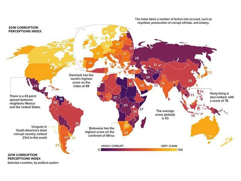
Aww, isn't that nice? Denmark is viewed as the least corrupt nation.
Globally speaking, though, it's not a pretty picture: More than two-thirds of countries score below 50 on the scale going from 0 (highly corrupt) to 100 (very clean).
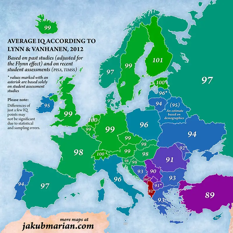
The European Union is filled with smarty pants. And the smartiest smarty pants, it appears, can be found in Finland, Estonia, the Netherlands and Switzerland.
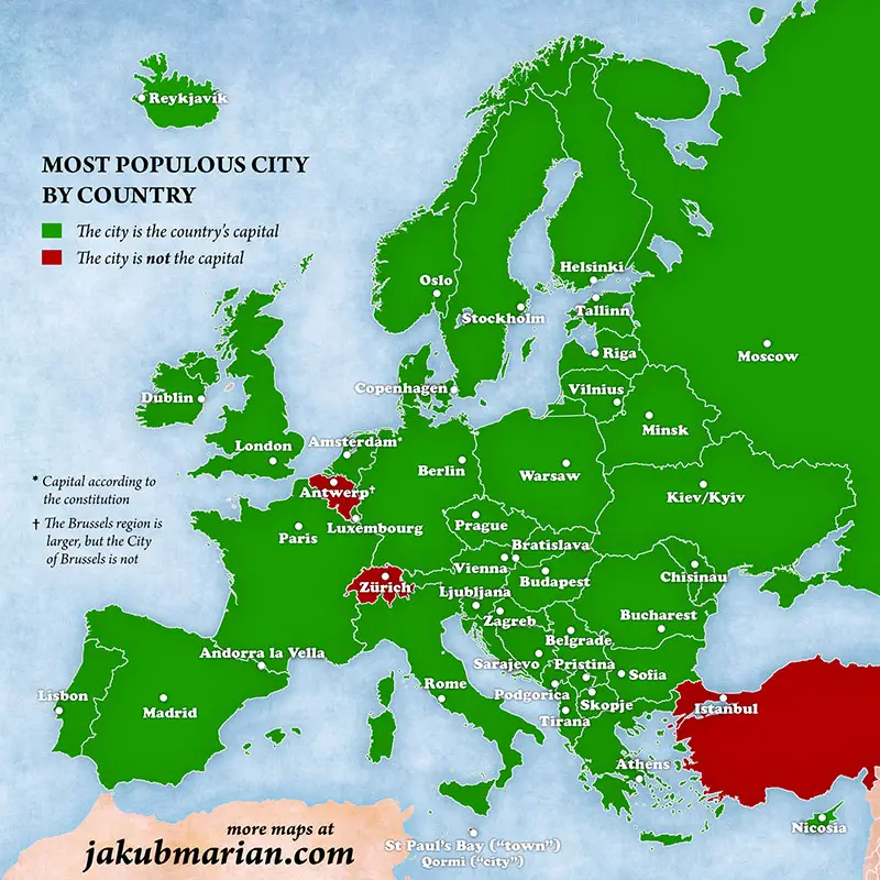
All but three countries' most populous cities are the capitals.
Interestingly, the most populous city in all of Europe, Istanbul (with 15.1 million residents), is not the capital of Turkey. That would be Ankara, which has about 5.5 million residents.
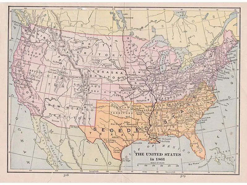
This is how the South looked in 1861 before and at the very start of the Civil War, after which the country united again.
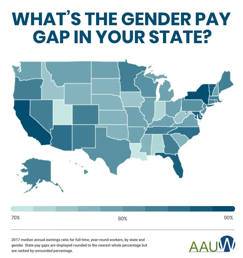
Yes, you're reading that right: In Utah and Louisiana, women make just about 70 percent of what men do. Yikes!
Even the states with the narrowest gap, New York and California, should be doing better, in our humble opinion.
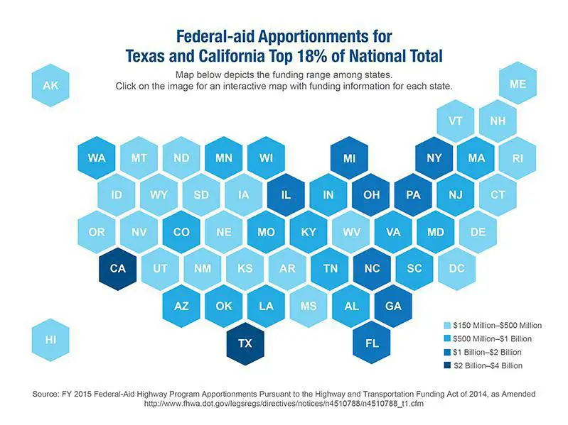
States receiving the most aid are those impacted by hurricanes, wildfires, blizzards and floods.
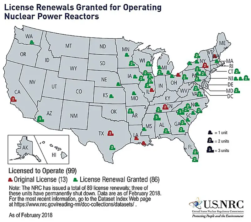
Across the U.S., 98 nuclear reactors power tens of millions of homes. Who knew so many were concentrated on the East Coast?
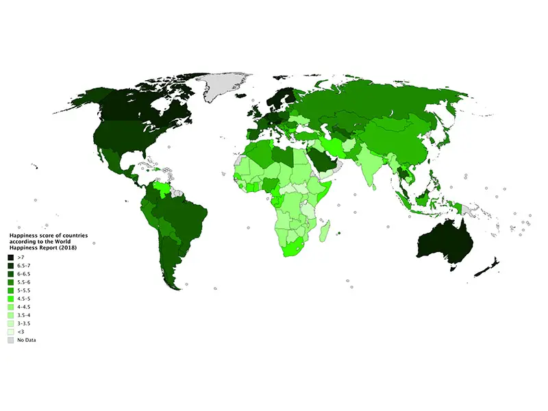
It makes us smile to see a hemisphere filled with happiness!
Also, is anyone surprised that famously cordial Canada, free-spirited Australia and peaceful Scandinavia have some of the happiest locals on earth?
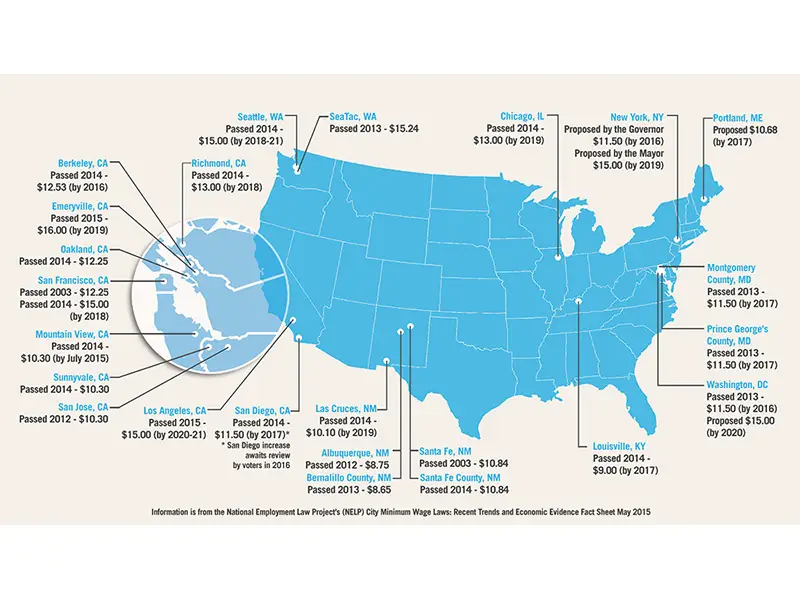
It's nice to know some states kept their word to raise the minimum wage by 2019.
The city with the current highest minimum wage is Emeryville, California, just outside San Francisco, where the rate is $15.69/hour.
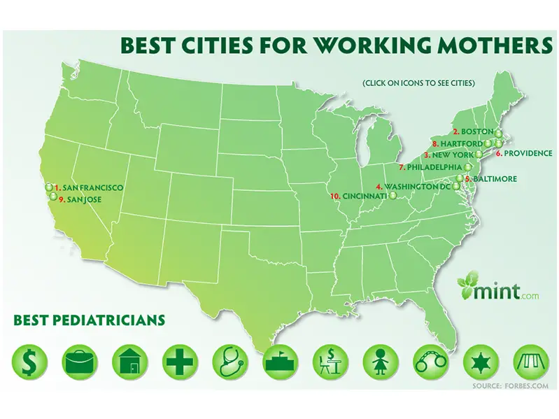
This map factored in salary, comprehensive benefits, safe neighborhoods, good schools, decent medical care and more to determine the best places for working mothers. The northeast looks like the best place to be!
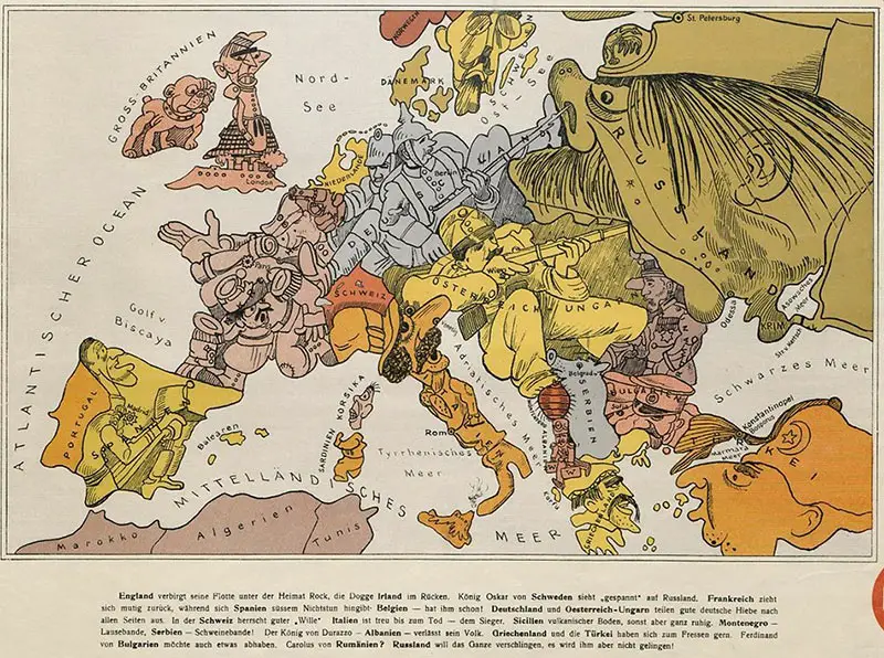
At the dawn of World War I, this map cartoonishly depicted how Germans perceived geopolitical threats. Russia was, clearly, of particular concern.
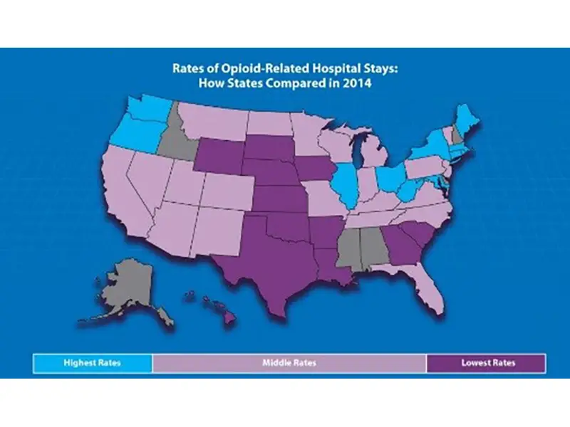
Opioid addiction is growing rapidly in the U.S. In fact, the National Institute on Drug Abuse noted that overdoses increased 30 percent in 52 areas across 45 states between July 2016 and September 2017.
As of January 2019, it was estimated that more than 130 people in the United States were dying every day from an opioid overdose.
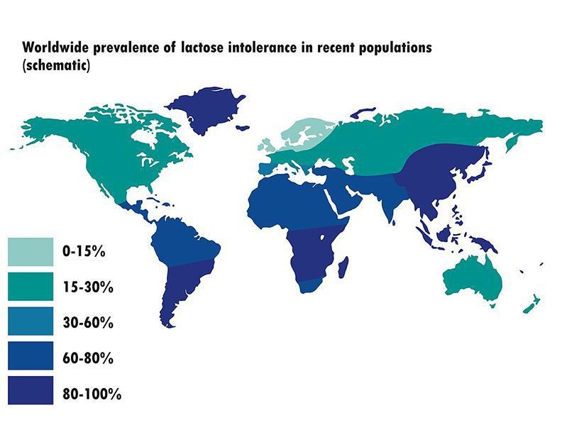
On a lighter note...We truly are heartbroken by those countries where many locals cannot enjoy cheese.
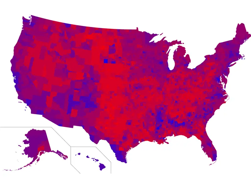
The red is for President Donald Trump and the blue is for Hillary Clinton, in case that wasn't already obvious.
Trump received 304 electoral votes to Clinton's 227. Yet because of how densely populated many of the blue areas are, Hillary still won the popular vote, with 65.8 million votes vs. Trump's 63 million.
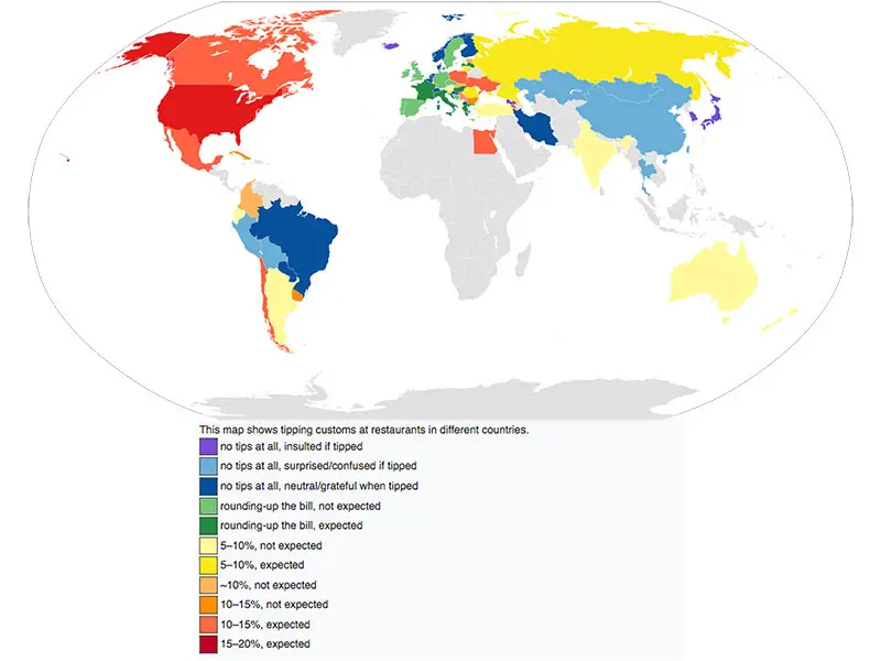
Now before you go thinking a country is cheap, remember that they may pay higher wages so employees don't need tips to make a living. (Unlike in America, which needs to get with the program.)
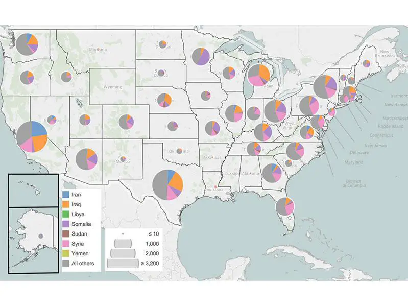
This map illustrates the refugees admitted into the U.S. in 2017, many of whom came from Syria. In 2017, one of the worst chemical attacks in history took place in Syria, claiming more than 39,000 lives.
The United Nations estimated that 13.5 million Syrians became refugees that year, in need of humanitarian assistance.
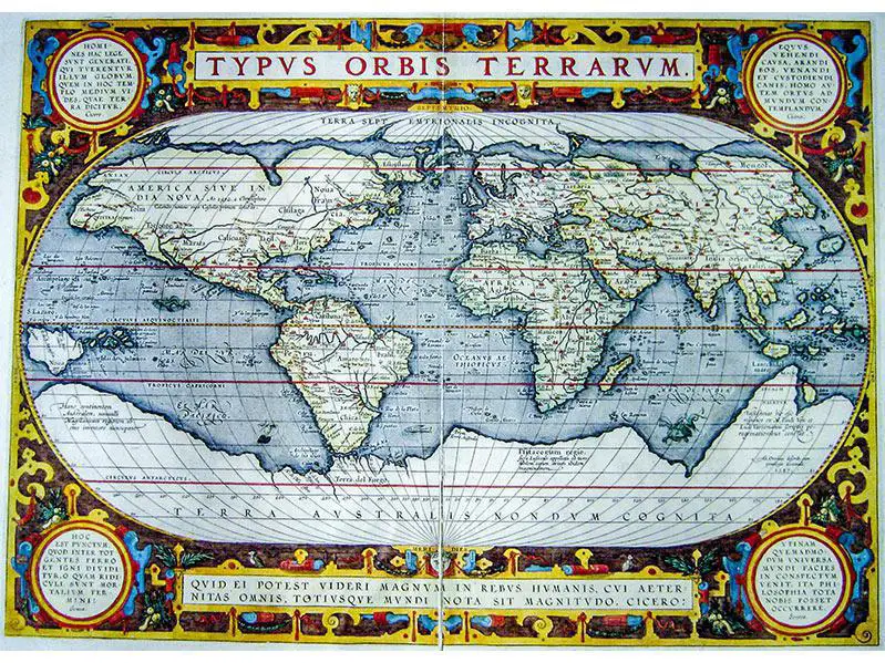
This map dates all the way back to 1595, when Queen Elizabeth I and King Philip II of England and Spain, respectively, ruled much of the world.
The quote at the bottom translates to, "For what human affairs can seem important to a man who keeps all eternity before his eyes and knows the vastness of the universe?"
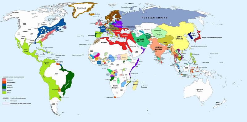
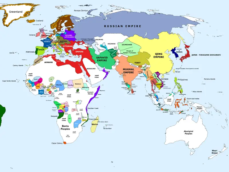
In case you were wondering how much things have changed over the centuries, this map proves that the answer is...a lot.
This is when the Mughal Empire in India was at its height, and the Safavid and Qing empires also enjoyed significant power.
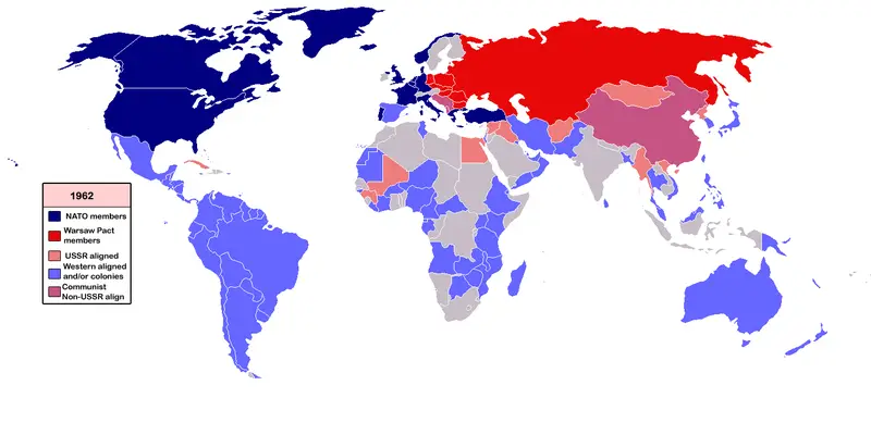
In 1962, in the throes of the Cold War, Warsaw Pact countries (including the Soviet Union, Hungary, Poland and East Germany) were battling NATO countries (including the U.S., Canada, France and West Germany).
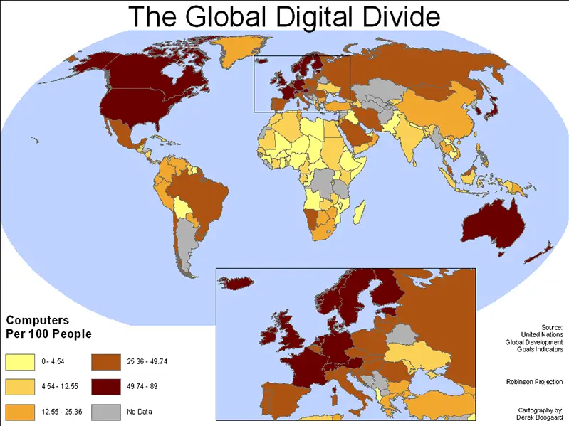
The world is not as tech-savvy as you may have thought.
The country with the most personal computers per capita is Switzerland (65), followed by the United States (57).
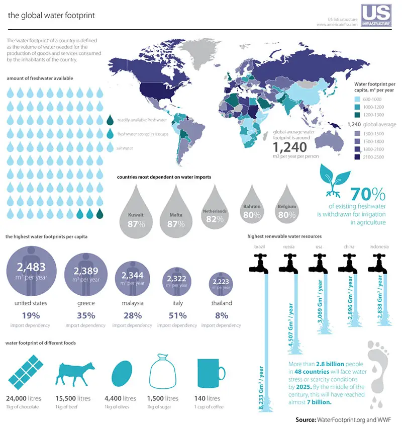
You may be surprised to learn the volume of water needed for the production of essential goods and services. This map brings the problem of water scarcity into sharp focus.
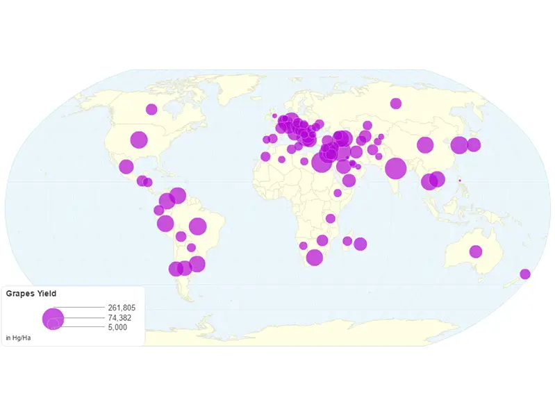
Where, oh where, does your favorite wine get its grapes from?
Can you name all of the countries by identifying their flags? How well do you know the flags of the world?